

How to Look at Art: A Beginner’s Guide to Seeing Like an Art Historian
A step-by-step guide to deep looking and discovering stories within a painting.

So I hear you’re interested in learning more about art history?

Well, one of the first things an art historian needs to be able to do is to know how to look.
And this isn’t a passive, quick task. One of the most important skills of an art historian (other than research and writing, of course) is patience. We look at thousands of images over our careers, some quickly, others intensely, but we know that if we want to truly grasp as much of the image as we can, we must give it time to speak to us (this sounds woo-y, I know, but bear with…).
In our current online culture, we are so used to spending only a few seconds, if that, deciding if what we are looking at is worthy of our time. In this post, I therefore task you with something that might feel arduous, or perhaps revealing, or maybe even exhilarating.
I want you to look at the image in this post for as long as possible.
Now, of course, you might not find this particular painting visually pleasing, or mentally stimulating. These factors will have an effect on your attention. However, I would argue that even if that is the case, it almost makes for an even better exercise, as it’ll really challenge your ability to pay attention.
An important thing before you begin: I want you to time yourself. See how long you can go actively looking at this painting before growing sluggish and distracted. As soon as you feel something else pulling your attention away, I want you to start writing, or stating aloud everything you see.
And there are no wrong answers. You cannot get this wrong. All you are doing, after all, is looking.
Now, if you’re really stuck, here are some of the things you might notice in this painting: the colours, the textures of the paint or perhaps of the painted fabrics, shapes- such as circles, rectangles, oblongs…, forms- such as objects in the environment, and of course, figures, be they solid or ethereal.
You might notice that your imagination also starts to fill in the gaps of your knowledge, coming up with stories behind what you’re seeing. Take note of these! They’re part of your interpretation of the work.
The main thing is to acknowledge, no matter how silly it feels, anything and everything that captures your eye.
Once you think you’ve seen it all, stop your timer. Consider how long you managed to look, and if anything interesting popped up the longer you dedicated to the task. I’ll make a calculated guess that most people found something else interesting in the work once they made themselves go that little longer.
Before I continue with my own example of such an analysis, let me know in the comments if you were happy with your time, or if it’s something you want to work on.
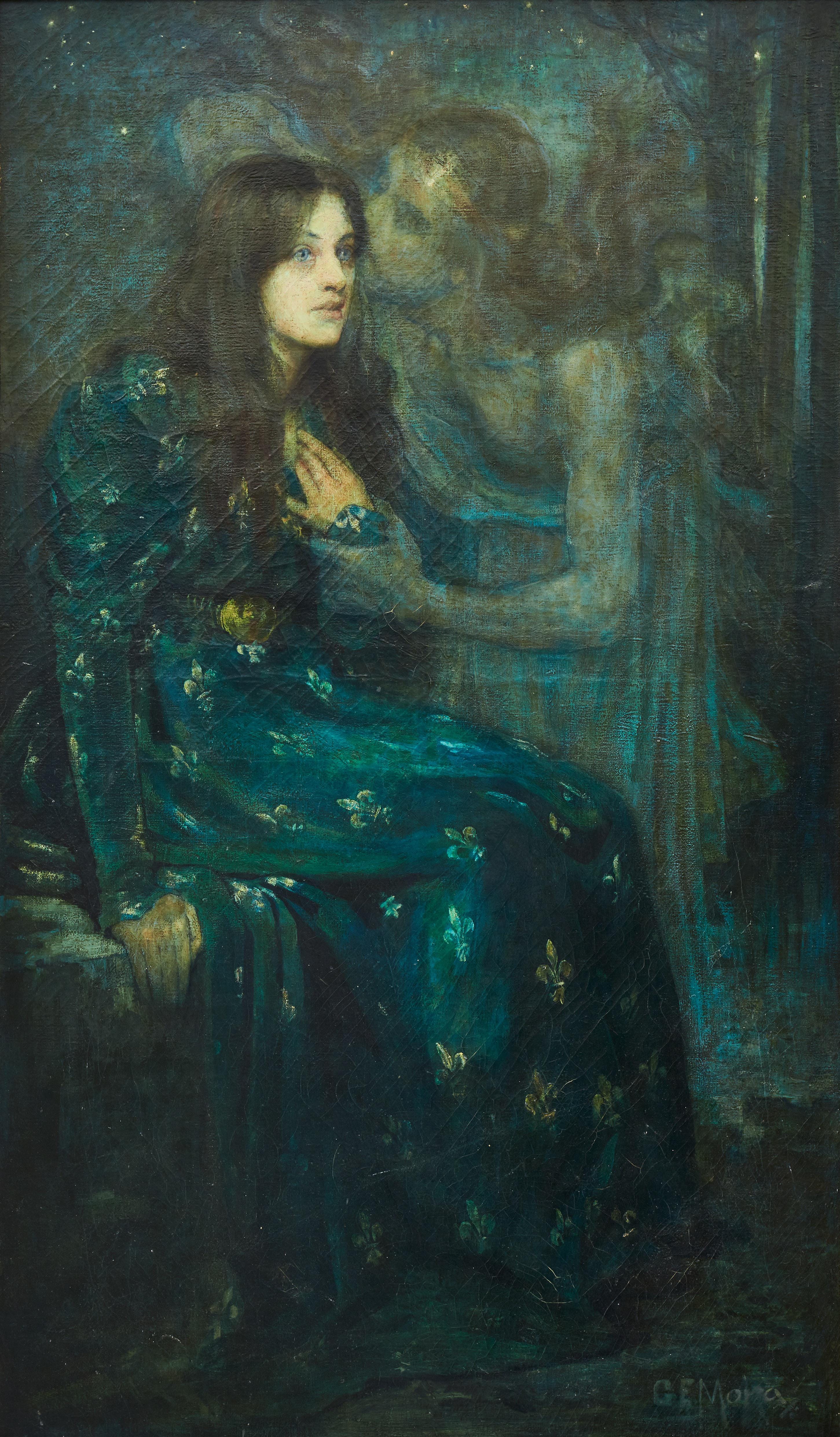
Here is the chosen painting for your first close looking visual analysis:
So, how do your observations compare to an art historian? Well, I’ve explained below everything we might take into account (when applicable to the painting, of course) when performing a close looking visual analysis, much like you’ve just done. If you have any history with practical arts, some of this will likely be familiar. I’ll also provide lots of visual, annotated examples of these aspects within the painting we’ve both just looked at.
When an art historian begins looking at a painting, we approach from diverse perspectives. I, personally, begin with the subject matter.

Subject Matter: the what
Subject matter is everything identifiable you see in the work that has been depicted by the artist. In the case of this painting, the subject matter includes:
A young woman sitting against a bench of some kind. She is wearing a long dress that makes me think of (the Victorian interpretation of) the British medieval era. I note that the dress has fleur-de-lis, which now makes me think she might be from France. She seems haunted by something, her expression melancholic and fearful.
An additional, ethereal figure, of ambiguous gender, hovering close to the woman. This figure is holding onto the woman’s wrist tightly, whilst the figures own hair dances about their head like gravity is having no effect against them. They are dressed in classical costume, very similar to a greek toga. They seem to be whispering something into the young woman’s ear.
I spot three trees in the background, at the top right of the picture plane (the area in which the scene of the painting takes up) - therefore, I can conclude that the figures are probably in an outside environment.
I then, lastly, see stars littering the distant sky- it is therefore nighttime.
You can of course go even deeper, but this is enough for now. Subject Matter is a great base for beginning your analysis of what the artist has wanted you to see, and therefore, how they might want you to feel, or respond.
From this point, I then consider the following formal elements…
Formal Elements: the How
Below, I explain some of the main formal elements Art Historians look at when analysing a single artwork. Take a look, and see how many of these you noticed, even if you didn’t have the words to explain it.
Composition: The arrangement of visual elements within the painting.
This is the accumulation of everything listed below, including subject matter.

Line: Types of lines used (straight, curved, implied) and their effect on the painting.
I’ve annotated here a mix of both implied (orange dashed) and actual lines (white). You’ll notice that most of these help draw your eye towards the central focus of the painting: the whisper occurring between the ghostly figure and the seated, haunted woman.

Shape and Form: Use of geometric or organic shapes and three-dimensional forms.
Here we see my annotations: the forms are rather soft and curved, with many circular forms making up the figures. Their bodies are sharp or angular, instead, they flow.


Colour: The palette, colour harmony, contrasts, and symbolic use of colour.
To create a visual I digitally pulled the main colours from the painting. However, if limited to simply speaking to this painting I would say that it has a deep, murky aquatic colour palette of blues and greens. This palette adds to the slightly off-putting, haunting, sickly feeling the painting has.

Texture: Real or implied surface quality (smooth, rough, etc.).
I’ve highlighted some areas where the texture of the paint is evident: thick globules of lighter pale green on the forehead of the ghostly spectre, the rough impasto of the highlight by the woman’s hand, and the odd (assumed) underpainting ‘stripes’ found all over the upper half of the painting. These, I think, are perhaps evidence of a previously painted work that the artist chose to go over.

Light and Shadow: Use of light and shadow (chiaroscuro, tenebrism) to create depth and drama.
Even though the subject matter of this work tells us that this scene is happening outside and at night, there is an implied source of light. We can identify where this is coming from by tracking the highlighted spots in the work: the sheen on the ghostly figures’ forehead, the light illuminating the woman’s face, her left hand, and the knuckle on her right hand. Additionally, we can see that there are aspects of this work shadowed by the figures. It’s difficult to accurately place the metaphorical ‘light’, as really, it sits in front of the art work, about where a viewer might be looking at the scene. I hope my poor annotations help you understand this!

Space: Techniques to depict depth, including perspective (linear, atmospheric), foreshortening, and overlapping.
This work uses a single linear perspective. We can tell because the space reseeds towards a single point. Artists use this to draw the viewers eye towards the pivotal visual moment of the painted work. Some artists will use multiple points, or they may ignore linear perspective altogether.

Lastly, Scale and Proportion: The size relationships within the painting.
This painting places the figures very close to the front of the picture plane. As previously mentioned, the picture plan contains the entire painted surface of the work. Within this painted space, (typically) when linear perspective is used, there will be three ‘grounds’: the foreground (the front) the mid-ground (the middle) and the background. In some works, this is easy to identify- especially given most works have a clear horizon line. In this piece, the figures are large: they take up the majority of the picture plane, however, they sit just between the fore- and mid-ground. This creates a sense of the scene being cramped, and might make the viewer feel as if they are right there with the figures depicted.


Well done! You made it… However, that’s JUST the formal elements done. This is an important part of the visual analysis, as it breaks down all the visual components that contribute to our understanding of the work. We can assume that the majority, if not all of these aspects were purposefully chosen by the artist: so once we have this information, we can then start to ask why?
And sometimes, answering that ‘why’ is made a little easier with information that isn’t evident in the object itself, such as medium and technique, style and movement, and contextual influences. All these aspects speak to, or outright explain the formal elemental choices of the artist, and help us understand the (likely) impact this work therefore has on viewers.
If you were viewing this artwork in a museum, you’d be able to read a small wall-text that accompanies the work. This text should include, at the very least:
The artist’s full name
Their birth and death year
The artworks title
The artworks date of creation
The artworks medium and support
Then, typically, how it entered that collection.

If you’re not looking at an artwork at a museum, however, you might have to do some digging to find the correct information- as I had to do for this painting.
With a brisk search online, I was able to find a listing from when the work was last sold. From this, as well as additional sources, we can conclude that our artwork was painted by Gerald Moira, who was born in England in 1867 and died in 1959- His signature can be seen in the bottom right corner.
The painting itself is titled ‘The Silent Voice’, and was probably completed around (circa) 1893. It might have an additional subtitle as well: Thereto the silent voice replied, ‘Look up tro’night: the world is wide’. This references a particular piece of literature, which I’ll refer to soon. I also assumed that it was oil on canvas, which seems to be confirmed through this research.
Okay, so, now we know the visual elements of the work, who painted it, and when. With some additional background knowledge, we can then start to piece together all the elements provided.
The analysis: the Why
My first point of focus is the date of the work: c. 1893. This places it in a very particular time period, an era broadly considered to be ‘post-impressionist’. This is a very wide scope of artistic creation; essentially, most works made after the craze of impression had started to waver. This doesn’t really tell us much about the kind of content the artist might have engaged with, their intentions in painting the work, nor their influences…
So let’s go a little deeper.
I believe that this work is typical of the Symbolist movement. Why?
Well, first, the subject matter. Symbolists were concerned with the spiritual, the space beyond the known natural world, and in their art they attempted to evoke a meaning or feeling concerned with this central idea.
Symbolist art shifted the emphasis from the direct representation of nature to the world of the imagination. Instead of describing something with precise, realistic detail or stating facts they used personal metaphors and symbols, evoking a meaning or feeling instead. Or as Mallarmé explained in a letter, the idea was, “to paint not the thing but the effect it produces”. This marked a shift away from the prevailing naturalist and realist approaches of the time, and was partly a reaction to the increasing industrialisation and scientific advances they saw around them. Symbolism offered an antidote, not only to scientific uncertainties, but to the materialism of industrial Europe. It rejected reality, offering an escape into the world of dreams and visions, spiritualism and mythology. - National Galleries of Scotland.
The time period, region, and the subject matter of this painting all fit this description: the scene, as we know, shows a young woman caught in an embrace with an ambiguous, non-human entity. She seems fearful, perhaps spiritually overwhelmed. The setting they are placed within, the colour palette, and the texture of the work all highlight this feeling of the supernatural, of the unsettling, emotive imagination. And, there’s another clue…
The title.
(Little trigger warning here for discussion of suicide)
‘The Silent Voice: Thereto the silent voice replied, ‘Look up tro’night: the world is wide’
This title refers to a poem by Lord Tennyson titled “The Two Voices,” which was written between 1833 and 1834. It was included in his 1842 collection of Poems. Tennyson wrote the poem, titled then as "Thoughts of a Suicide" in manuscript, after the death of his friend Arthur Henry Hallam in 1833. The poem was autobiographical.
The subtitle references to this specific part of the poem:
 I said, "When first the world began
  Young Nature thro' five cycles ran,
  And in the sixth she moulded man.

"She gave him mind, the lordliest
  Proportion, and, above the rest,
  Dominion in the head and breast."

Thereto the silent voice replied;
  "Self-blinded are you by your pride:
  Look up thro' night: the world is wide.

"This truth within thy mind rehearse,
  That in a boundless universe
  Is boundless better, boundless worse.

"Think you this mould of hopes and fears
  Could find no statelier than his peers
  In yonder hundred million spheres?"

It spake, moreover, in my mind:
  "Tho' thou wert scatter'd to the wind,
  Yet is there plenty of the kind".

Then did my response clearer fall:
  "No compound of this earthly ball
  Is like another, all in all".
The poem is thought to be composed in an experimental form of poetic dialogue, with Tennyson's primary aim being "the creation of a sustained poetic dialogue—the exploration of a road ultimately not taken in [his] career."1
It portrays the poet's internal struggle to counter a voice that repeatedly advocates for suicide, asserting twice within the poem that "there is one remedy for all."2
Then comes the check, the change, the fall,
Pain rises up, old pleasures pall,
There is one remedy for all. (ll. 163-165)"Cease to wail and brawl!
Why inch by inch to darkness crawl?
There is one remedy for all.” (ll. 199-201)
Knowing this poetic context, we can conclude that our artist Moira was likely engaging with the heavy and lyrical narrative of this poem when he painted The Silent Voice: the whispers of melancholy made visible in the ghostly figure, it’s strong voice edging the young woman towards such a ‘final act’.
Understanding both this literary influence, and the painting’s stylistic movement, helps us to better comprehend the work we have already unpacked.
We can start to complete the puzzle.
Now, of course there are other aspects I haven’t been able to cover in this particular piece, but you should be aware of them for your future analysis. Additional aspects of context that can be important are:3
Influences: Connections to other works, artists, or traditions.
Artist’s biography: Background, biography, and artistic intentions.
Patronage: Who commissioned the work and their motivations.
Audience: Who was intended to view the painting and its social role.
Function: Religious, political, decorative, or personal use.

Now that we fully understand the image’s formal elements, and better comprehend the subject matter it is depicting, as well as understanding the stylistic, and therefore it’s socio-cultural influences, we can more accurately comprehend this painting.
We now understand that the colour palette was sickly and ethereal due to both it’s subject matter and it’s stylistic influences; We know that the tight space of the picture plane, where the character’s sit very close to the foreground, purposefully create a sense of claustrophobia: there’s no space to breath, let alone move- to escape the deadly song.
Additionally, we remain a metre or so away from the woman- a distance that places us as a close onlooker, a voguer, unable to reach her before the spectral voice convinces her of it’s argument. How close is this voice to reaching us?
We understand now that the implied lines of the work draw our eye from every angle and aspect up towards that moment of contact- the voice uttering it’s deadly poetic call; and that the soft light and deep shadows, and the rough texture of the paint all lend themselves to the ephemera nature of the in-between, of something not of this earth.
We can even go further, bringing our own, emotional interpretation to the painting.
Now, perhaps, her right hand, seemingly caught at the crux of gripping the bench upon which she sits; is she about to anchor herself back down to earth, to life, or has she just let go?
Is she going to let the voice, which traps her left hand in it’s grip of melancholy, steal her away from this existence?
Now, perhaps, we see the ghostly figure as a siren, as a metaphor, as a real supernatural creature, or even a religious being?
Is this just about fear and horror? Something trivial and spooky?
Or has this turned into something immensely personal?
And that’s the beautiful thing about visual analysis. With practice, we can understand the formal qualities of the work, and allow this to broaden our understanding of what the artist might have intended to convey. Your personal response might even have been lead by the artists’ skilful hand of visual manipulation.
No matter what, though, your personal reading of the work- your imaginative bridging of the stories gaps, your emotional response to it- that’s just as valid as the one the artist intended.
In fact, it might be the most important visual reading of the work.
So, how did you find your first visual analysis? Did you learn anything new? What story did you initially create about the work? How different was it to the artists’ intention? I want to hear all about it!
I look forward to reading your responses in the comments!

McGann, Jerome J., ed. (1989). Victorian connections (1. publ. ed.). Charlottesville: University Press of Virginia. pp. 121–145. ISBN 0-8139-1218-0.
Contemporary Response to the poem
(Taken from Wiki, because I have little knowledge on English Literature!)
Jerome Buckley asserted that the poem is "tinged with Satanic irony", and "the voice of negation, cynical and realistic, puncturing a desperate idealism, forced upon the reluctant ego an awareness of man’s fundamental insignificance" and that it "remains intense as the colloquy of denial with doubt in the dark night of the soul".[7]
Basil Willey claimed: "Tennyson, in my view, should not be blamed…for failing to find a solution where no solution exists; nor should he be accused of wishful thinking when he asserts... that the Heart has its reasons of which Reason knows nothing."[8]
William R. Brashear's "Tennyson's Third Voice: A Note" points out that the argument is between "Dionysian" (emotional human nature) and "Socratic" (intellectual) voices. The Dionysian ("the still small voice") is of conscious, subjective fact. It "does not call upon the poet to reason, only to see that "it were better not to be".
Further analysis avenues:
Historical and Theoretical Perspectives
Chronology: Placement within the timeline of the artist’s career or art history.
Theoretical Frameworks: Use of feminist, post-colonial, psychoanalytic, or other critical lenses to interpret the work.
Condition and Conservation
State of Preservation: Damage, restorations, or aging effects.
Alterations: Changes made post-creation (e.g., retouching, cropping).
Innovations
Technical Advancements: New techniques or technologies introduced.
Unique Features: Elements that distinguish the painting from others.
Thanks you so much, I felt the work that you put into it. I’m very very new to art history and it gave me some tools
(When I saw the painting of Moira for the first I had no clue about the subject 😅)